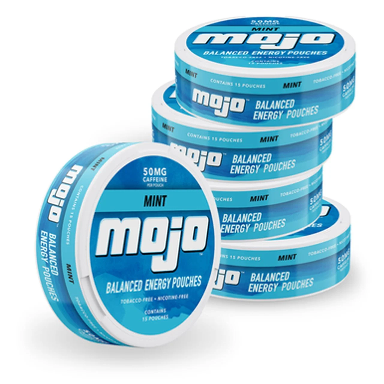
Mojo® Energy Pouches was a brand with an identity problem. Caffeine pouches in a round can that people associated with nicotine and an old-school look that didn’t exactly scream, “I’m a modern take on energy!”
That’s where we came in. Because this brand is redefining energy, we needed to redefine what it looked like. We shaped the entire look and feel with a fresh, fun vibe that radiates motion, flavor, and possibility.
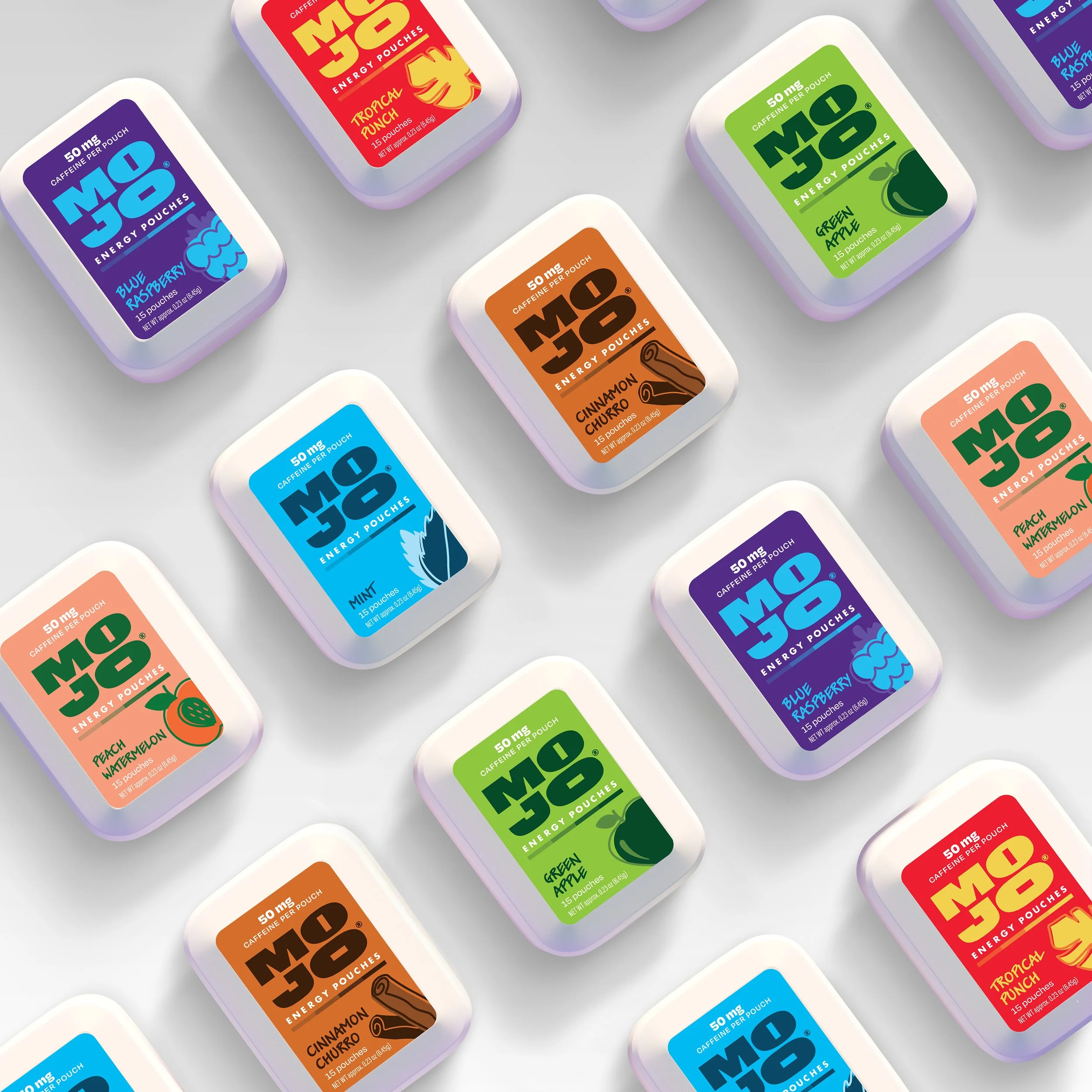
The new Mojo logo is simple yet unapologetically bold. Clean and elegant, it pushes away from any stereotypical energy brand tropes to be sure it stands out. Subtle details like the shape of the pouch tucked inside the O’s make sure it’s completely unique.
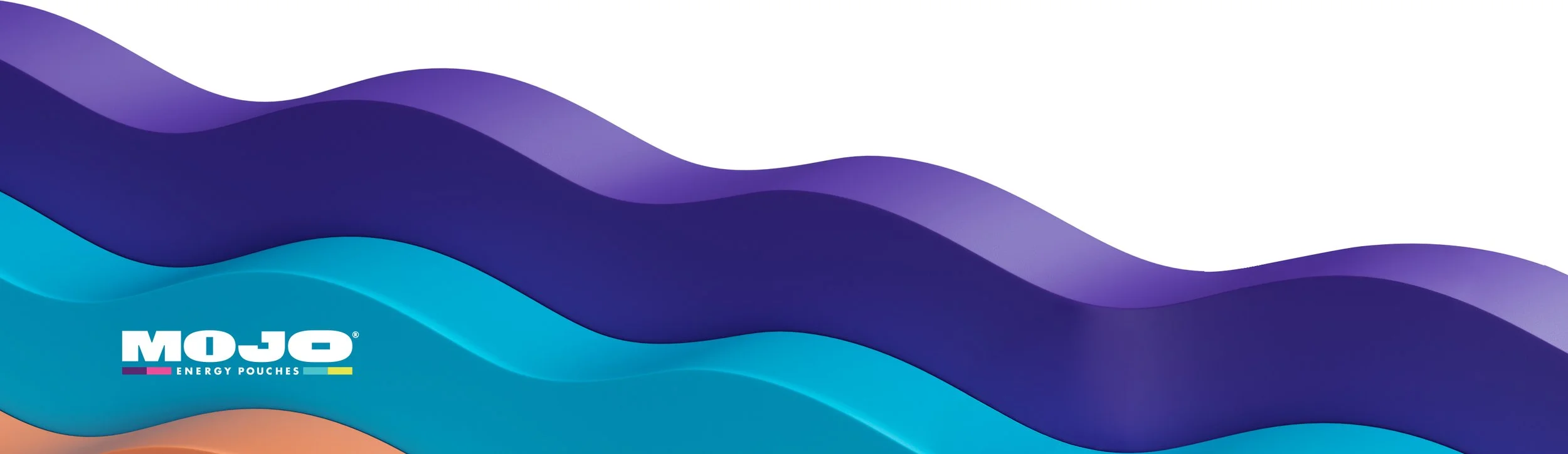
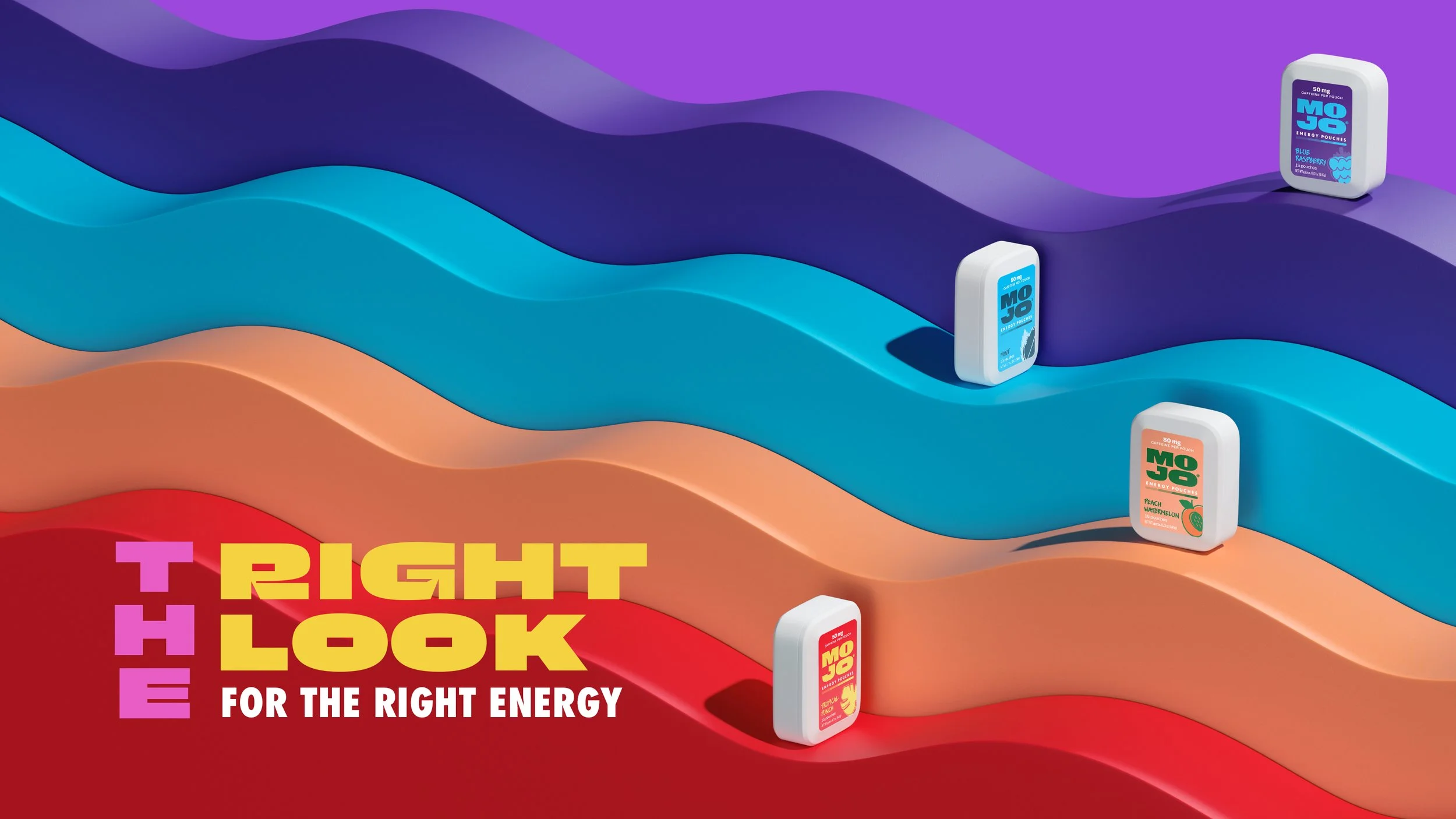
The logotype itself flexes to fit any application, stack it on pack or run in a single line in digital placements. The lively palette of deep purples and blues, plus bright punches of pink and yellow ensures the identity exudes energy, just like the product.

We put it all together on a modern slider pack that breaks free of the old round can in the back pocket stereotype. Each pack is a mini party with floating flavor icons, a gradient flavor bar, and playful illustrations that nod to the mouthwatering taste held inside.
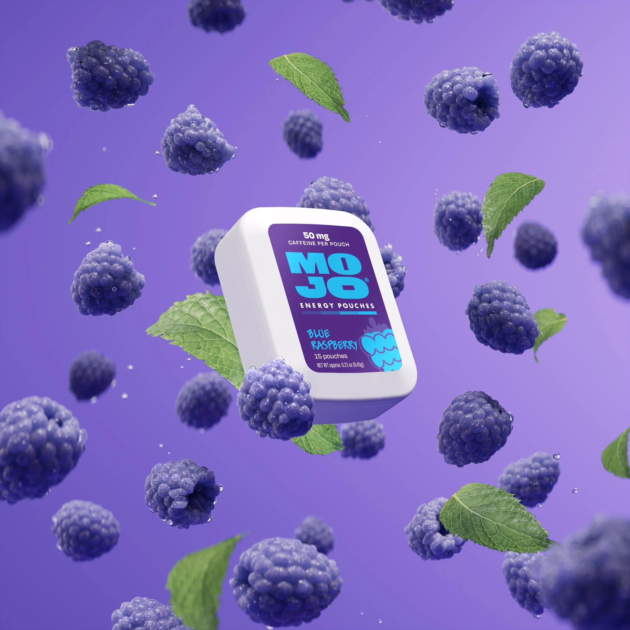
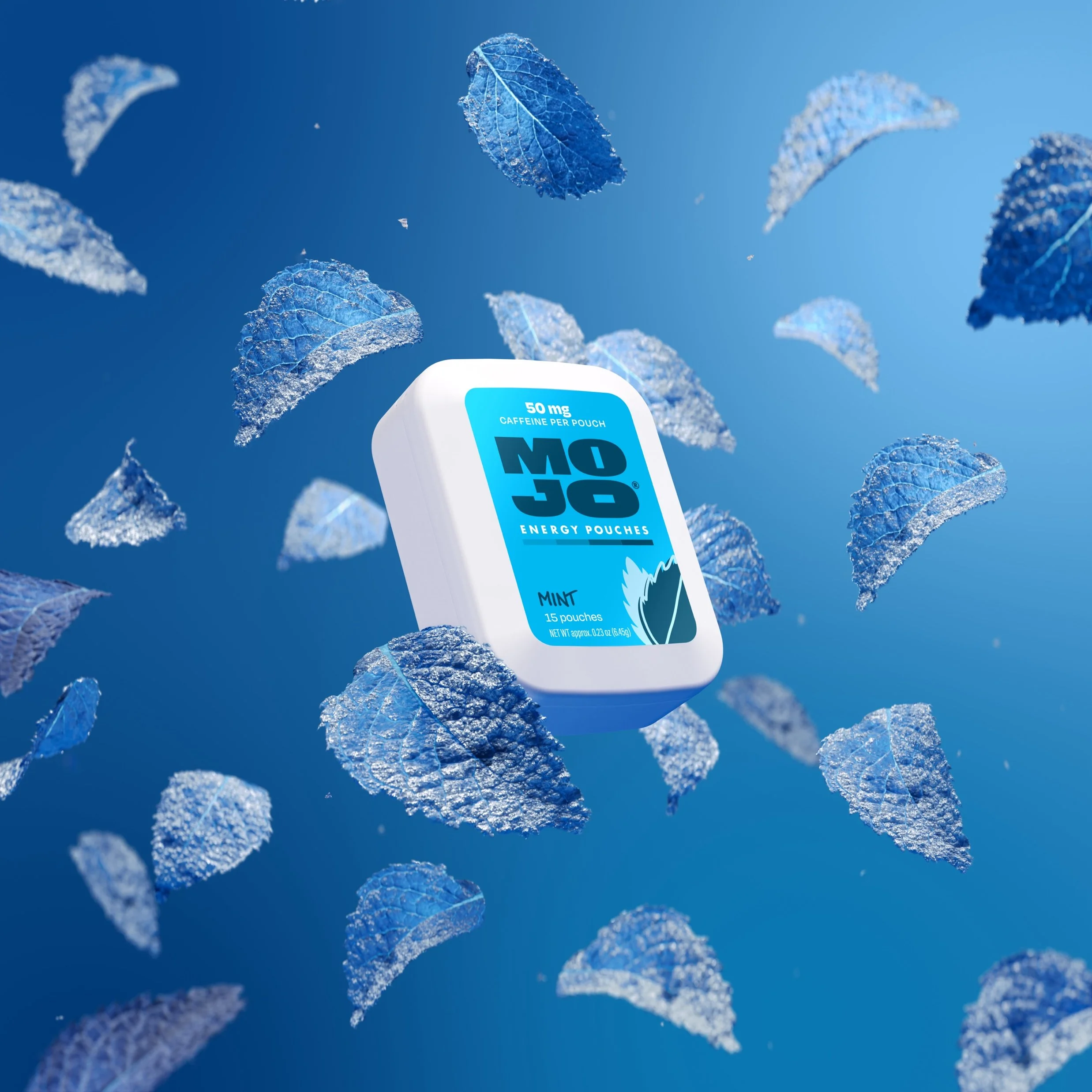
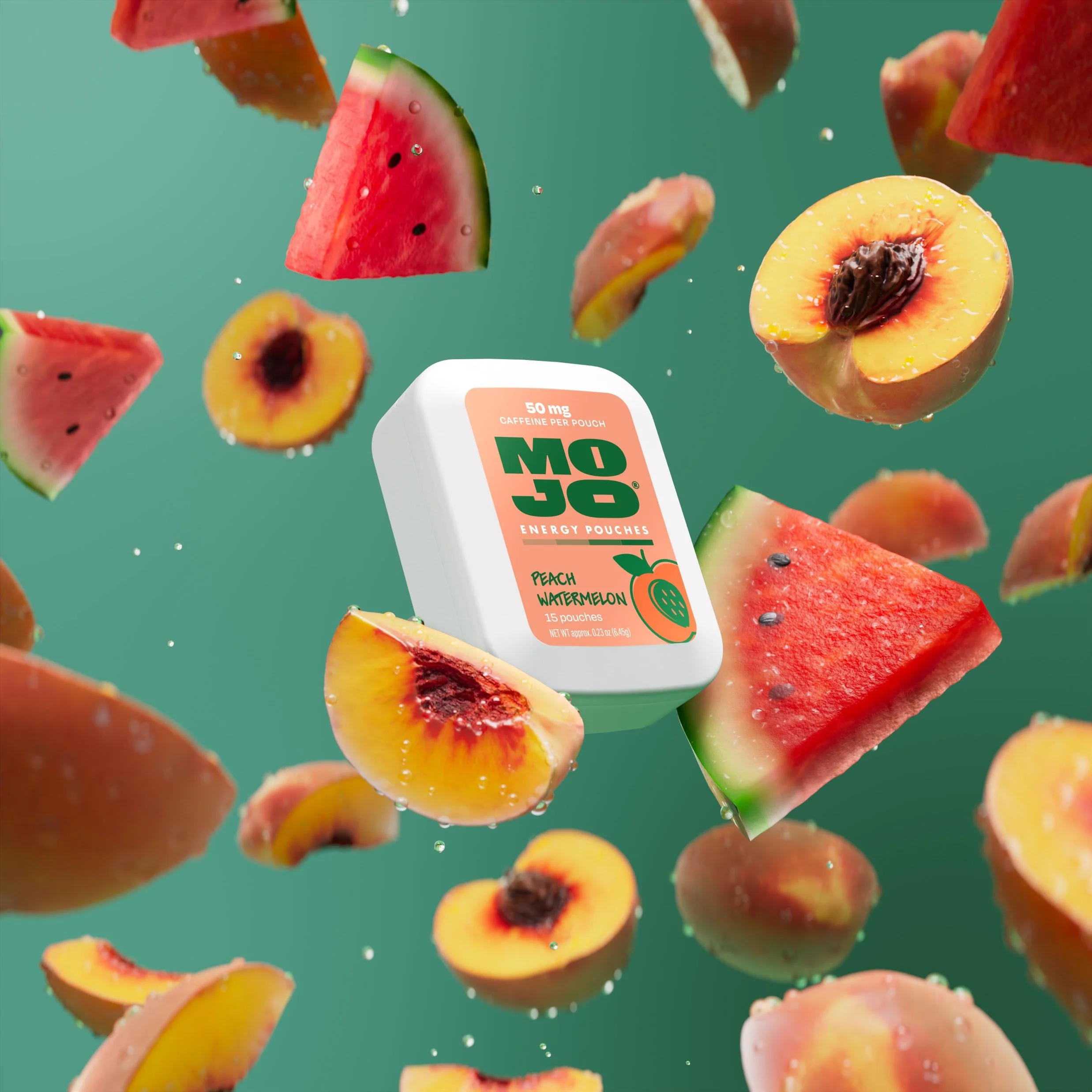
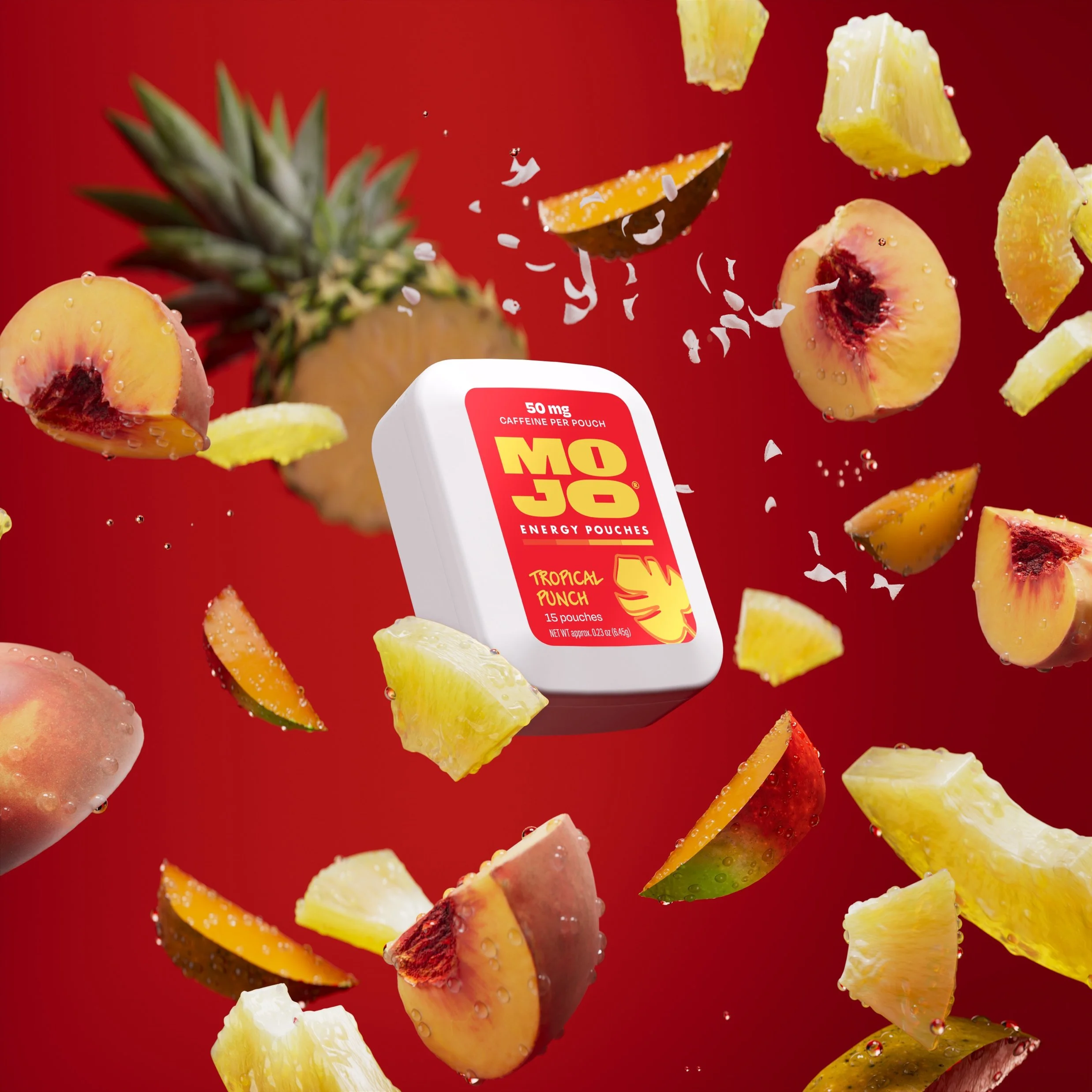
Product photography leaned into motion and flavor cues while also heroing the new mark. And design elements like a color waves brought to life the feeling of the smooth energy Mojo provides.
From the precise flavor silhouettes to the purposeful three-color pack palette, everything tells a unified story—this is a fresh way to get just-right energy with a modern look that feels just right.