The Letter That Became a Language
Circle K is one of the most recognizable convenience brands in the world. Its logo was doing its job.
What wasn’t working was everything around it. As the brand expanded across formats, markets, and moments, the identity had become noisy and inconsistent—too reliant on the logo to carry recognition, and not flexible enough to work at speed. The challenge wasn’t to redesign the mark. It was to design a system that could finally keep up with it.

The K, Simplified
We didn’t change the Circle K logo. We went inside it.
By reducing the existing “K” to its most essential parts—straight lines, angles, and arcs—we created a small, disciplined set of shapes that could do more than the logo alone ever could.
These elements bring structure, direction, and familiarity to every layout. Used lightly, they support clarity. Used more boldly, they give the brand energy and movement.
A System That Knows
When to Do Less
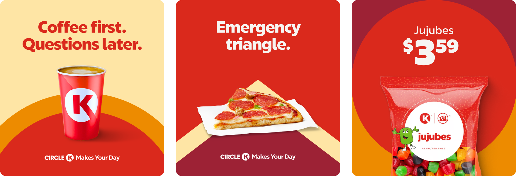
The system is built on restraint. There’s a direct relationship between content and complexity: This creates clarity at every size, from small digital placements to large-format signage, while keeping the brand readable at speed.

Color That Carries
the Brand
Color does the heavy lifting. Circle K red and orange remain the core of the identity, bold, warm, and instantly recognizable. Supporting yellows, mustards, and darker tones add flexibility without diluting impact.
The result is a palette that feels optimistic, confident, and unmistakably Circle K.
The Result
A brand refresh that proves evolution doesn’t always mean change. By simplifying the K, amplifying color, and designing a system that knows when to step back, Circle K now shows up with greater clarity, consistency, and confidence everywhere it lives.